UI/UX DESIGN & DIGITAL EXPERIENCES
Frictionless web, mobile, and SaaS interfaces engineered with rigorous ergonomic precision, high-converting customer journeys, and scalable design system component architecture.
WHAT IS INCLUDED IN UI/UX DESIGN
A complete digital framework engineered for effortless user adoption and seamless engineering handoff.
User Flows & Information Architecture
Mapping low-friction user journeys, sign-up flows, checkout funnels, and navigation hierarchies that eliminate cognitive overload.
High-Fidelity Interface Design
Crafted in Figma with dark/light themes, subtle elevation shadows, generous whitespace, and sharp typographic hierarchy.
Atomic Component Design System
Comprehensive library of reusable buttons, input fields, dropdowns, modal windows, table views, and status notifications with auto-layout.
Interactive Clickable Prototypes
Fully interactive prototypes simulating real transitions, gestures, micro-animations, and drawer interactions for stakeholder testing.
Mobile, Tablet & Desktop Layouts
Pixel-perfect responsive screen designs explicitly tailored for mobile smartphones (375px+), tablets, laptops, and ultra-wide screens.
Developer Handoff & Token Specs
Organized layers, variable token documentation (spacing, color, typography), and SVG asset exports to streamline engineering delivery.
THE 4-STEP UI/UX DESIGN PROCESS
A data-informed, user-tested progression from rough concept to production-ready design system.
UX Research & Wireframing
Conducting user task analysis, rapid low-fidelity wireframing, and validating layout architecture before adding visual styling.
Visual UI & Design System
Building high-fidelity screen mockups in Figma, setting typography rules, color tokens, and atomic interactive elements.
Prototyping & Micro-Interactions
Connecting screens into a clickable prototype with smooth easing curves, hover reactions, and realistic mobile tactile feedback.
Design System Handoff
Packaging the Figma workspace with organized component variants, CSS specs, icon exports, and developer walkthrough notes.
SELECTED DIGITAL PRODUCT CASE STUDIES

AURA MOBILE OS
Next-generation spatial smartphone operating system design system featuring glassmorphic depth, gesture widgets, and micro-interactions.
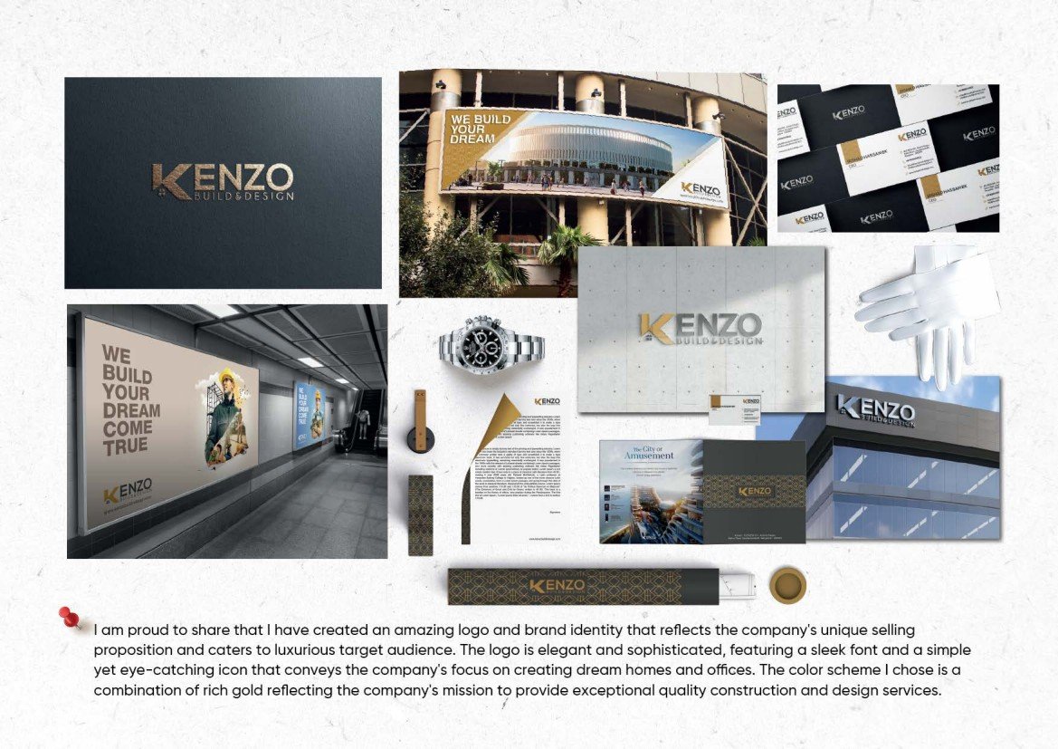
DAMAC LUXURY REAL ESTATE PORTAL
High-conversion interactive property showcase platform engineered for ultra-high-net-worth investors across Dubai and London.
UI/UX DESIGN FAQS
All interfaces are designed natively in Figma utilizing auto-layout, interactive component variants, design tokens, and synchronized cloud libraries for seamless teamwork.
Yes. Every project includes explicit breakpoint mockups for mobile screens (iOS & Android touch targets of at least 44px), tablets, and full desktop displays.
Absolutely. Files are systematically structured with logical naming conventions, design tokens (colors, radii, spacing, fonts), ready-to-copy CSS properties, and exported vector SVG assets.
Yes. Whether starting from a raw napkin sketch or redesigning an existing SaaS product, I guide the architecture from user wireframing all the way to high-fidelity design systems.
READY TO BUILD AN EXCEPTIONAL DIGITAL PRODUCT?
Let us transform complex workflows into intuitive, conversion-focused digital interfaces that users love.